BillCraft - Branding & Identity
Project Overview
Complete brand identity design for BillCraft – from logo construction to color palette and typography. A modern, accessible design system for an Austrian fintech platform.
The branding for BillCraft was developed to convey trust and professionalism while remaining modern and accessible. The brand identity reflects the platform's core values: simplicity, transparency, and innovation.
Challenge
A fintech platform needs a design that appears both professional and inviting. The challenge was to create a visual system that builds trust without appearing stiff or outdated.
Solution
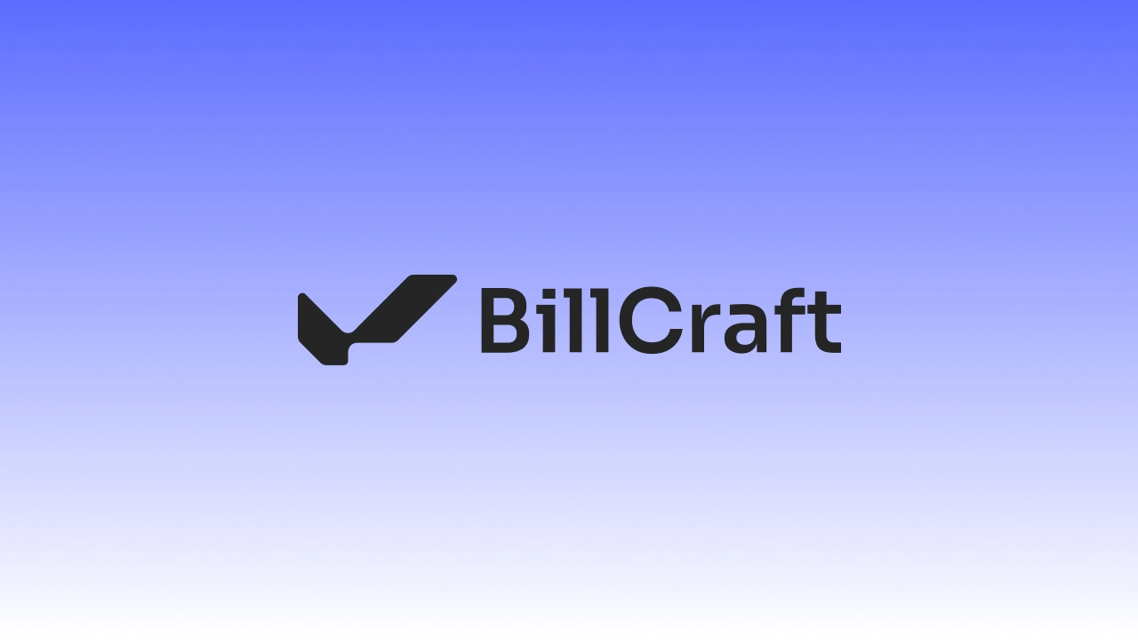
By combining clean geometric shapes, a modern color palette with Blue and Pink as accent colors, and the Sora typeface, a contemporary brand identity emerged. The logo symbol is based on a check mark, symbolizing trust and confirmation.
Typography
Sora
Sora, meaning sky in Japanese, is a typeface family commissioned for the Sora decentralized autonomous economy focused on empowering projects that benefit society by providing infrastructure and social currency for transactions in the ecosystem.
AaBbCcDdEeFfGgHhIiJjKkLlMmNnOoPpQqRrSsTtUuVvWwXxYyZz
1234567890!?$/@#'&*%+×÷=±
Color Palette
White
HEX #FFFFFF
RGB 255 255 255
Graphite Black
HEX #252525
RGB 37 37 37
Blue
HEX #5B6CFF
RGB 91 108 255
Pink
HEX #FF5BAD
RGB 255 91 173
Navy Blue
HEX #222647
RGB 34 38 71
Dark Blue
HEX #374199
RGB 55 65 153
Gray
HEX #EFEFF6
RGB 239 239 246
Logo Construction
Tech Stack
Project Info
Year
2025
Category
Branding